Quiet Confidence with Layered Neutrals and Tactile Depth

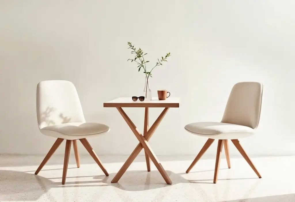
Choosing a Grounded Neutral Palette
Reading Undertones with Confidence
Place your prospective paint or fabric next to the truest white you own and a known warm reference, like natural oak. Look for shifts toward pink, green, yellow, or violet. That tiny nudge determines whether your beige feels sunlit or stale. Build out from that undertone consistently, and neutrals suddenly connect like a considered family rather than a random pile.
Testing in Real Light, Not the Store
Tape large samples to multiple walls and leave them for at least two full days. Observe morning coolness, midday neutrality, and evening warmth. Photograph on your phone to catch color casts your eyes normalize away. Notice how fabrics change against different woods and stones. A careful light study saves money, repainting, and disappointment later.
Balancing Warm and Cool Without Conflict
Mixing temperatures works when you assign roles. Let warm elements anchor—oak floors, wool rugs, parchment shades—while cool notes refine—honed marble, oatmeal linen, soft gray clay. Repeat each temperature at least three times to make the conversation intentional. When warm and cool appear in balanced echoes, the space feels alive, not indecisive.
Texture: The Quiet Force Behind Depth
Soft Layers That Set the Mood
Start with a generous rug to anchor the acoustic and tactile experience. Add linen curtains that whisper when the window opens, a bouclé chair for playful contrast, and a cashmere throw for quiet indulgence. Keep patterns restrained, letting weave and nap carry the interest. The goal is tactile dialogue, not visual shouting.
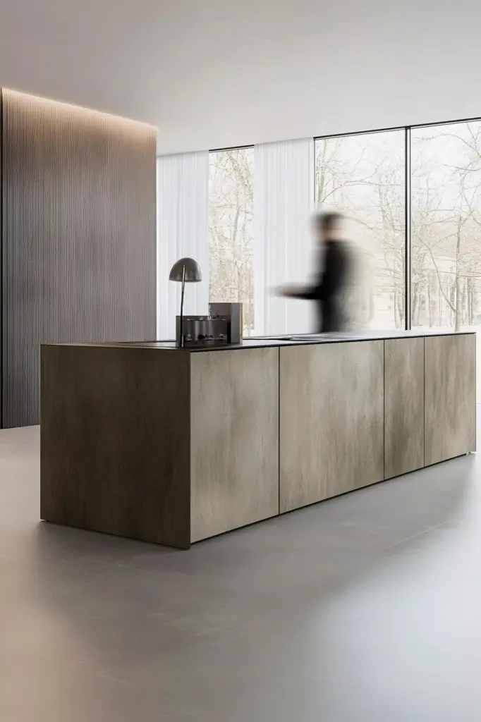
Hard Surfaces with Gentle Character
Honed stone, unlacquered brass, limewashed plaster, and cerused oak bring age and credibility. Imperfections catch light softly, turning walls and tables into living backgrounds. Choose subtle movement in stone rather than bold veining. Favor hand-glazed tiles over machine-perfect ones. These details read as calm yet storied, especially under grazing light at dusk.
Contrast Through Finish, Not Color
When color sits quietly, finishes do the storytelling. Pair matte walls with satin wood, rough ceramics with smooth glass, and featherweight sheers with dense wool. The differences give your eye something to explore. Keep transitions intentional: repeating a finish at least twice ensures cohesion while preserving that delicious, understated tension.
A Layering Method: Scale, Proportion, Repetition
Foundations: The Big Moves
Walls, floors, and the largest upholstery pieces establish the baseline. Choose a calm, friendly neutral for walls, then a comfortable rug that harmonizes with floor tone. Anchor seating with fabrics carrying subtle weave. Keep these choices restrained so everything layered next can shine without competition.
The Middle Layer: Rhythm and Relief
Side tables, throws, ottomans, and lighting build the rhythm. Alternate textures—linen against leather, ceramic beside wood, raffia near stone. If two adjacent objects share similar color, prioritize contrasting texture to avoid monotony. This is where rooms start to feel collected rather than cataloged, offering small discoveries at every glance.

Accents That Honor Restraint
Earth-Derived Hues as Gentle Highlights
Think clay, lichen, river stone, and weathered bark. These references harmonize with linens and woods, preventing jarring transitions. A rust velvet pillow beside greige wool creates a delicious, grounded warmth. Use small doses across the room to nod to nature’s steadiness without stealing attention from texture.
Monochrome Art with Tactile Impact
Choose charcoal drawings, plaster reliefs, or textile art where texture tells the story. Handmade paper edges, stitched canvases, and layered gesso catch shadows beautifully. Frames should be quiet—oiled oak, blackened steel, or thin white profiles—so the surface quality feels like the main character rather than the border.

Light That Reveals, Not Shouts
Durability, Care, and Real-Life Ease
Family- and Pet-Friendly Choices
Caring for Tactile Surfaces
Budget-Savvy Layering
Styling Vignettes That Feel Effortless
Seasonal Shifts Without Upheaval
Spring to Summer Refresh
Autumn to Winter Cocoon
A Simple Rotation Ritual
Join the Conversation and Keep Exploring
All Rights Reserved.