The Quiet Drama of Built Beauty

Today we explore Architectural Details That Create Subtle Grandeur, revealing how tiny decisions about proportion, light, texture, and joinery awaken a powerful calm. Rather than shout, these moves converse with time, guiding the eye, inviting touch, and rewarding attention. Settle in, reflect, and share your own observations, sketches, or photos so our community can learn together and refine an appreciative, discerning gaze.
Proportion That Whispers Power
True presence often begins with ratios so balanced that rooms feel inevitable. Adjust a doorway a few inches, widen a reveal by a finger, or align a cornice with a sill, and suddenly the space steadies the breath. Subtle grandeur grows when scale honors human comfort while hinting at ceremony, creating dignity without spectacle and confidence without strain.

Hidden Harmonies of the Golden Ratio
The golden section need not be diagrammed to be felt. When windows, wainscots, and mantlepieces quietly echo harmonic ratios, the room reads as dependable and poised. Even small alignments—stair riser to handrail return, pilaster width to panel division—stabilize the composition. Try sketching your favorite room, trace its relationships, and notice how balance reveals itself beyond labels.

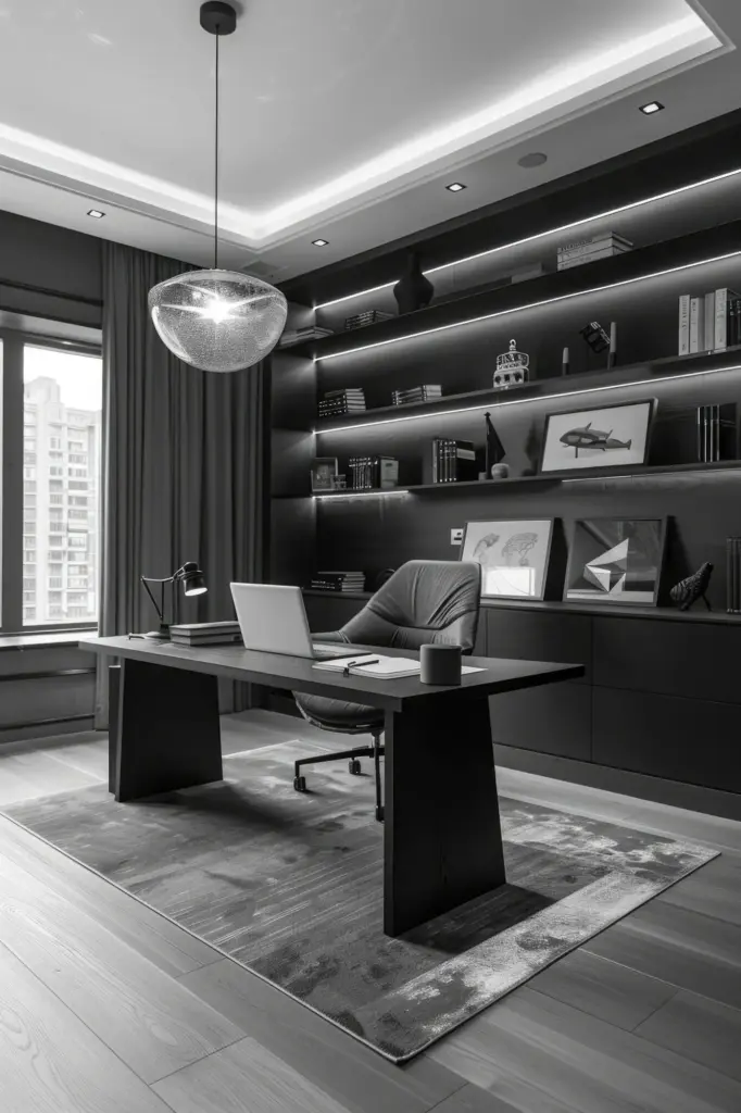
Ceiling Heights that Breathe
Ceilings that rise just enough to stretch posture, then lower to cradle conversation, modulate experience like a musical score. A slightly taller entry frames arrival; a modestly cozier alcove invites lingering. Layering beams, coffers, or delicate crown can emphasize this choreography. Share how ceiling changes influence mood at home; your anecdotes help others sense proportions more intuitively.
Light, Shadow, and the Poised Pause
Light grants structure meaning, turning planes into personalities. Recesses, coves, deep returns, and layered surfaces allow shadows to speak, tempering brightness with tender gradations. Subtle grandeur appears when glare is softened, highlights are placed, and transitions feel intentional. Notice how dawn and dusk rewrite your rooms each day; then design to honor those fleeting, generous moments.
Recessed Reveals that Draw a Line of Silence
A narrow reveal where wall meets ceiling sets a crisp horizon of shadow, visually lifting the plane and refining edges. It separates elements without conflict, giving each material its voice. In galleries, such reveals calm reflections; at home, they frame light like a mat around artwork. Post photos of your favorite shadow lines and what they change in perception.
Soft Coves that Float the Ceiling
Cove lighting dissolves corners, letting the ceiling hover weightlessly. When dimmable, it shifts from daylight companion to evening glow, cueing rest without dramatic contrasts. Choosing warm temperatures and diffusers preserves texture while avoiding hot spots. Try a mockup with tape lights and paper reflectors; feel how modest indirect light can grant rooms both uplift and repose.
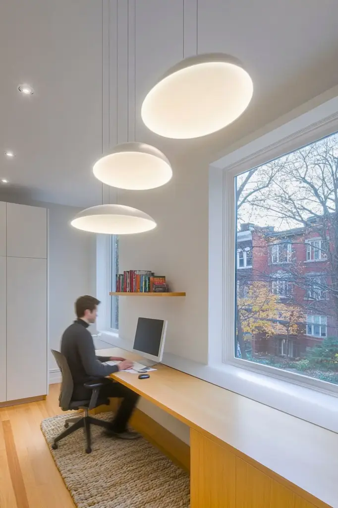
Deep Sills that Invite the Hand
A generous sill becomes a ledge for elbows, books, and potted herbs, shaping how daylight meets occupation. Depth intensifies shadow gradients, making masonry seem solid and timber honest. Even in slim walls, a built-out apron can evoke gravitas. Share your favorite window perch memories; these micro-places teach us where light, comfort, and attention naturally converge.
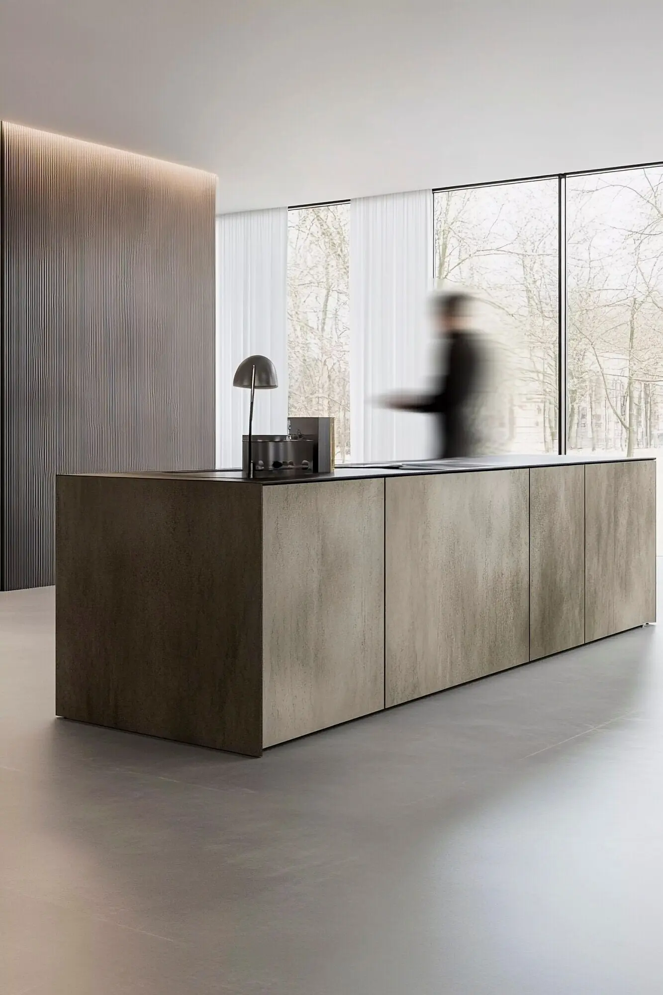
Texture You Feel Before You See
Surfaces broadcast stories at arm’s length. Honed stone, brushed timber, and hand-troweled plaster change with the day, revealing craftsmanship as the light grazes. Subtle grandeur prefers textures that age sympathetically, welcoming patina instead of resisting it. Consider how your fingertips wander along rails and walls; designing for tactility creates belonging, memory, and quiet emotional resonance.

Edges, Joints, and the Art of the Interval
Where materials meet, character is decided. Crisp arrises, eased corners, and precise gaps express intention and skill. A careful joint can dignify ordinary materials, while a careless one diminishes the finest stone. Subtle grandeur emerges when every intersection feels inevitable, inviting a slow look and rewarding curiosity with thoughtful reveals, honest tolerances, and impeccable alignment.
When Less Suggests More
Highlight one junction—a door surround, hearth, or stair turn—and allow other areas to recede. This hierarchy concentrates attention where meaning resides. It also respects budgets and maintenance. Show us how you decided where to invest detail in your project; those decisions illuminate values, use patterns, and the narrative you want daily life to tell.
Instead of heavy motifs, consider shallow relief, delicate reveals, or tone-on-tone patterns that reward close viewing. Such echoes nod to history without burdening surfaces. They photograph modestly yet feel rich in person. Post an example where a restrained profile replaced a bulky molding; your before-and-after can help others measure the impact of disciplined substitution.
Pulls, latches, and hinges sit at fingertips, shaping daily experience. Solid metals, precise tolerances, and comfortable profiles convey care. A quiet finish—antique brass, matte bronze, or satin nickel—ages gracefully. Share your favorite handle and why it delights; stories of tactile satisfaction teach how micro-choices aggregate into calm, durable, and dignified environments.

Fenestration Cadence with Intent
Set a baseline module—say, a window width—and relate mullions, shutters, and panels to it. Vary only for purpose: a view, a corner, an entrance. The slight exceptions add interest by telling a story. Share a facade you admire and annotate its pattern; collective diagrams help decode why certain street fronts feel timelessly composed.
Bay Spacing that Serves Interior Life
Exterior rhythm should honor interior function—dining tables, reading nooks, beds, and desks. Let structure and use co-author spacing so beauty and practicality coincide. Document your plan with overlays showing furniture and grid; noticing misalignments early saves cost and preserves clarity. Post your lessons learned so others can avoid visible compromises later on.

Grids that Disappear into Ease
A disciplined grid may be invisible once complete, yet it calms signage, aligns switch plates, and organizes tile. Choose a module suited to materials, then let details obey. The payoff is a pervasive rightness felt, not announced. Share your preferred modules; our community’s range will help beginners adopt adaptable, forgiving rules that survive real-world constraints.

A Townhouse Reborn Through Alignment
A narrow brownstone gained calm when door heads matched window heads and baseboards resolved at stair turns with tailored returns. Nothing ostentatious—just consistent lines, honest materials, and care at junctions. The owner reported guests speaking softer without knowing why. Share similar transformations; alignment often proves the most generous, cost-effective path to dignified character.
A Library Composed of Daylight
Deep-set windows, pale timber shelves, and a soft cove turned a small reading room expansive. Indirect light protected books while grazing plaster for gentle sparkle. Visitors lingered longer, reporting less fatigue. Offer your techniques for glare control and task illumination; balancing comfort with clarity builds environments where focus, serenity, and curiosity thrive together every day.
All Rights Reserved.